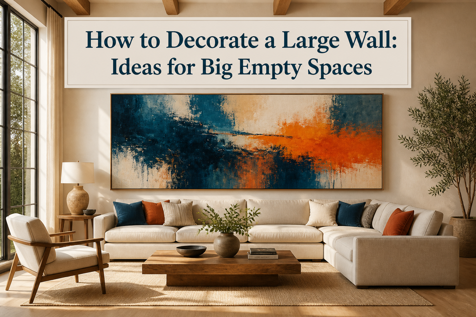
A finished large wall looks intentional from the moment you walk in, but getting there takes measuring tape, patience, and usually one failed attempt you live with for a month before redrilling. The mistake most people make is not the art they pick; it is the size. A single piece needs to span 60 to 75 percent of the wall’s width to hold its own, and anything smaller gets swallowed by the drywall around it. I hung a 24-inch print over an 84-inch sofa once, and from across the room you barely registered it was there.
1. Large-Scale Art
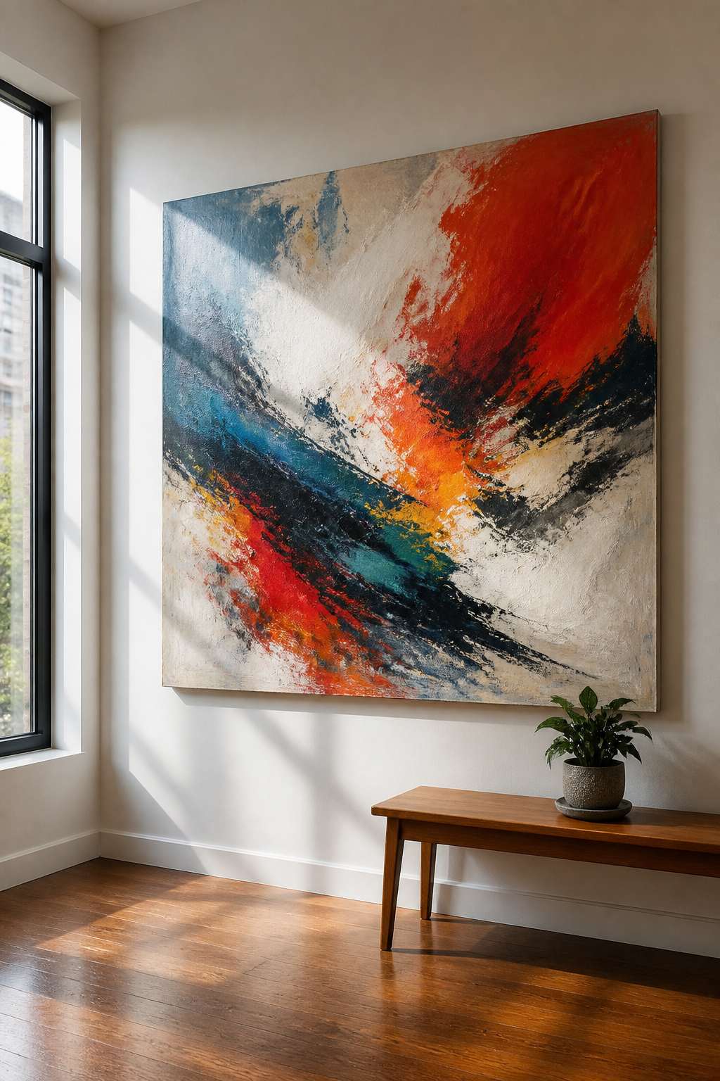
A single oversized piece does what clusters of small frames rarely manage: it gives a large wall a clear center of gravity. The eye lands once and rests, instead of bouncing between five or six disconnected things that never quite add up.
The proportion rule that actually works is 60 to 75 percent of the wall’s width. On a ten-foot wall, that means a piece roughly six to seven and a half feet across. Go smaller and the wall starts swallowing it; the room feels like a waiting area with something hung as an afterthought.
Height matters just as much. The center of the piece should sit 57 to 60 inches from the floor, which lands at average eye level for most people walking into the room. I hung a horizontal abstract too high once, maybe seventy inches, and the whole wall felt top-heavy and off-kilter for months before I moved it down.
The image itself needs to stay simple at scale. Bold abstracts, wide landscapes, or high-contrast photography hold up; busy detail turns muddy when it blows up. One strong piece avoids the scattered, unfinished look that makes large walls feel like someone ran out of ideas partway through.
Recommended Products

【Oversized Abstract Horizontal Wall Art】This oversized 72"W x 36"H horizontal framed canvas print wall art features bold black ink-style organic outline shapes on a warm neutral background, creating a mid century modern minimalist statement piece for your living room, bedroom, dining room, home office, hallway or entryway
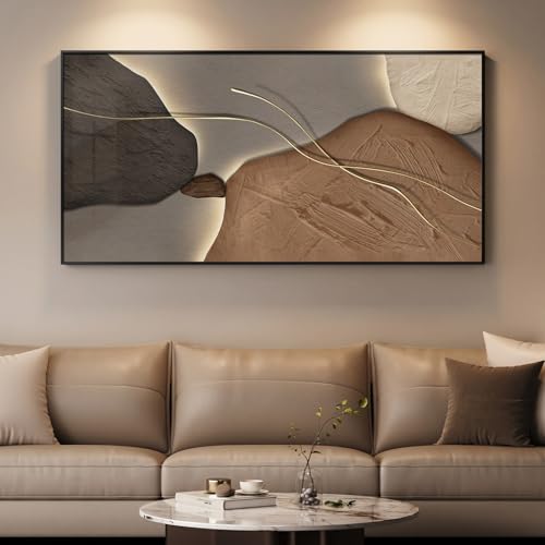
Modern Abstract Wall Art: This big wall art decor measures about 28.5"H×56.6"W inches and features a layered abstract design in soft brown, tan and charcoal tones. The extra large horizontal wall art prints create a calm, modern focal point that adds depth and interest without overwhelming the room
2. Gallery Wall
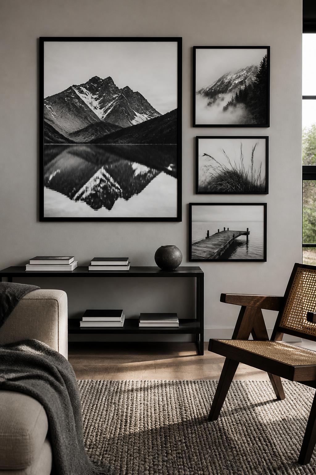
A gallery wall fills a large blank without the commitment of one oversized piece, and the mix of frames lets you pull from what you already own. The trick is stopping before it becomes visual noise. Four to seven pieces, tops, with one thread running through them — a consistent frame finish, a shared mat color, or a tight palette — reads as intentional; twelve scattered frames with nothing connecting them reads as clutter.
I learned the hard way that too many small pieces, especially on a tall wall, just look busy from across the room. One or two larger anchors among the smaller frames keeps the scale honest. The 3–6 inch gap between frames gives the grouping structure without rigidity.
The planning happens on the floor, not the wall. Tape out the wall dimensions, lay the frames inside that rectangle, and shuffle until the weight feels balanced. A quick phone photo locks the layout before you lift the hammer. The center of the whole arrangement should sit about 57–60 inches from the floor, roughly average eye level, so you are not craning up at it.
Recommended Products
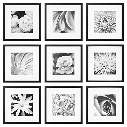
ELEVATE YOUR GALLERY WALL: With the Gallery Perfect 9-Piece Greywood Square Photo Frame Set, featuring nine square frames in a sophisticated grey wood finish. Each frame is equipped with a removable classic white mat, adding a timeless elegance to your displayed photos or artwork. The neutral grey tone complements any decor style, while the square shape adds a modern touch to your wall arrangement. Whether showcasing family portraits, travel memories, or artistic prints.
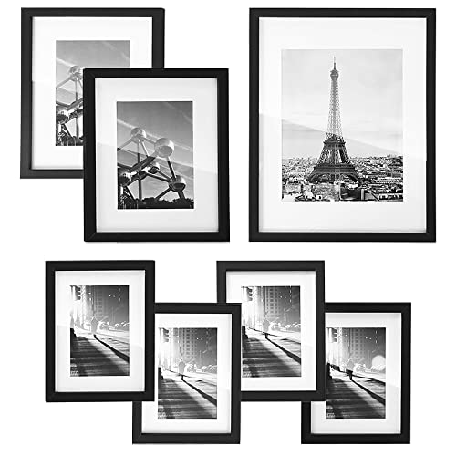
[Fits Various Picture Sizes] Each frame comes with 1 or 2 mats to fit full-size or smaller pictures, offering flexible photo options—6×8 frames also fit 4×6 pictures, 8×10 frames also fit 5×7 pictures, and the 11×14 frame also fits 8×10 pictures

Minimalist Style: Classic black color, aluminum frame with real glass – Each 11 x 14 photo frame comes with a removable mat. Please note, image shown is for reference only and not included
3. Mirrors
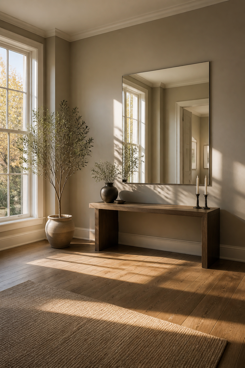
A single large mirror does more to open up a wall than a cluster of small ones ever will. I learned this the hard way after hanging three 12-inch rounds above my sofa, stepping back, and realizing they read as confetti on a billboard. The wall still felt empty, and the room felt no larger. Swapping them for one 48-inch mirror changed the whole room. Light bounced deeper into the space, and the wall finally looked intentional.
Placement matters as much as size. Position a large mirror opposite or directly beside a window, and it doubles the natural light streaming through. In my dining room, the mirror sits adjacent to a south-facing window, not across from it, because the opposite wall holds a buffet I did not want to compete with. The light still carries, and the mirror picks up the brass chandelier at night, which I had not planned but now like.
Frameless or geometric shapes keep the look current; ornate frames lean traditional. Either works if the scale is right. A mirror too small for the wall, even a pretty one, disappears into the architecture and wastes the chance to expand the room.
Recommended Products

MIRROR SIZE – Set of 12 frameless real glass mirrors, each mirror tile is 12 x 12 inch. Advanced polishing technology makes safe and delicate edges

Premium Shatterproof Tempered Glass: This 78" x 35" oversized full length mirror is crafted with tempered glass, delivering crystal-clear, distortion-free reflections. The shatterproof construction minimizes breakage risk and enhances exceptional sturdiness, making it ideal for everyday home use and stylish home decor
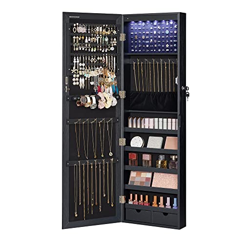
[Specialized Jewelry Cabinet] You deserve this well-constructed and designed jewelry cabinet from SONGMICS. The solid MDF body is for long-term use and the full-length mirror is framed to avoid leaving fingerprints on it every time you use the cabinet
4. Floating Shelves
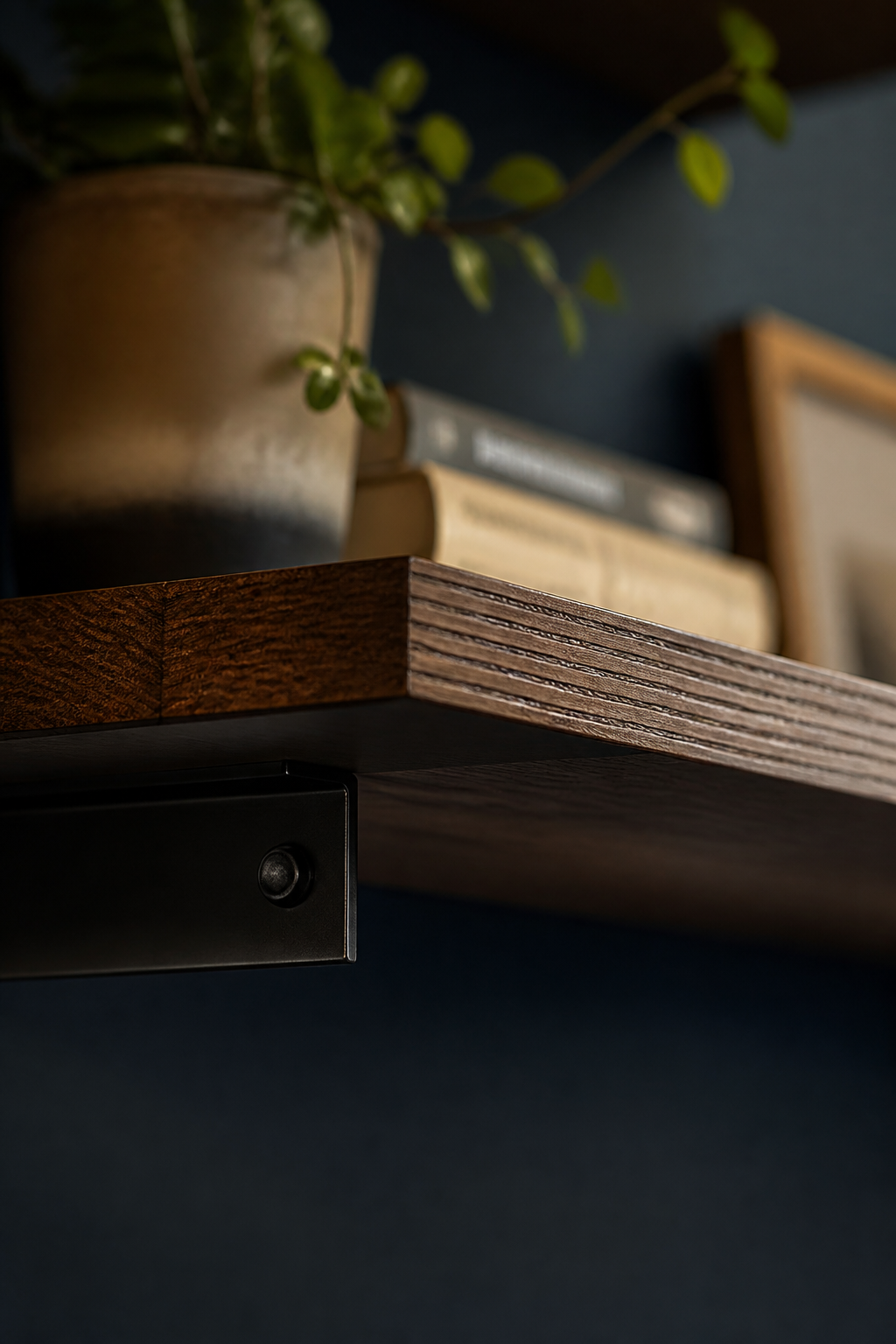
Floating shelves give a large wall purpose without the bulk of a full bookcase. I installed a staggered set in my living room last spring, three shelves at varying heights rather than a straight line, and the asymmetry keeps the eye moving. The rule I learned the hard way: leave at least one-third of each shelf empty. My first attempt had books and vases crammed edge to edge, and the wall felt cluttered instead of designed. Thin metal brackets or true floating hardware both work; renters can get the same effect with a console table behind the sofa if drilling is off the table. Wood tones tie in with other pieces in the room, while painted shelves can turn the whole arrangement into a single sculptural shape against the wall.
Recommended Products

Dimension & Artistic Design. Each piece measures 8" x 28" x 1.2". This 3-piece set features a unique 3D staggered, cascading arrangement that adds incredible geometric depth and a modern artistic vibe to your walls.

MOON PHASE MIRROR WALL DECOR: This unique moon phase mirror set with birds creates a striking gothic and witchy focal point, instantly elevating bedrooms, living rooms, or spiritual spaces.

SET OF 2 11×15 INCH RECTANGULAR DECORATIVE WALL MIRRORSThis HMANGE 2-piece decorative wall mirror set features a universal 11×15 inch rectangular silhouette, delivering the perfect balance of eye-catching presence and flexible fit for most home spaces. Unlike tiny decorative pieces that get lost on blank walls, this set lets you hang the two mirrors symmetrically to create a bold, cohesive visual focal point above a sofa or fireplace, or split them between different rooms to build a unified style throughout your home with zero full renovations.
5. Accent Wall Treatments
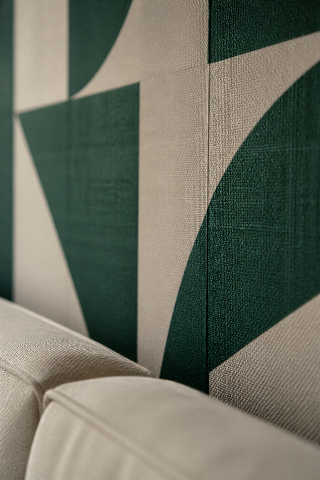
Wallpaper on a large wall only works when the pattern matches the room’s scale. A tiny floral repeat on a 12-foot span looks like a mistake, busy and distant at the same time. Bold prints or geometric patterns hold their own across that much real estate, and peel-and-stick options mean you can pull it down Saturday night if the scale reads wrong.
Wood paneling or faux brick does the same job without the pattern risk. The texture itself becomes the feature, so you stop hunting for the right combination of frames or shelves to carry the wall. I learned this after spending two weekends arranging and re-arranging a gallery wall that never looked intentional. Covering the surface instead of cluttering it removes that pressure entirely.
The repeat should measure in feet, not inches, for walls over ten feet wide. Subtle textures, like plaster effects, read as cozy rather than empty even without anything hung on them. That leaves the room feeling finished, not waiting.
Recommended Products
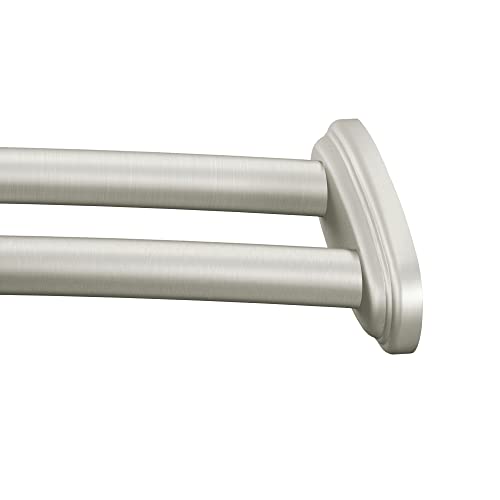
STANDARD SIZE: Curved shower rod fits most at-home shower sizes, adjustable to fit 57-inch to 60-Inch shower enclosures

COORDINATING ACCESSORIES: The double shower curtain curved rod coordinates with other Moen bathroom accessories

Moon Wall art per set size:30 x 60inches x 1pcs(75 x 150cm x 1pcs)
6. Sconces or Lighting
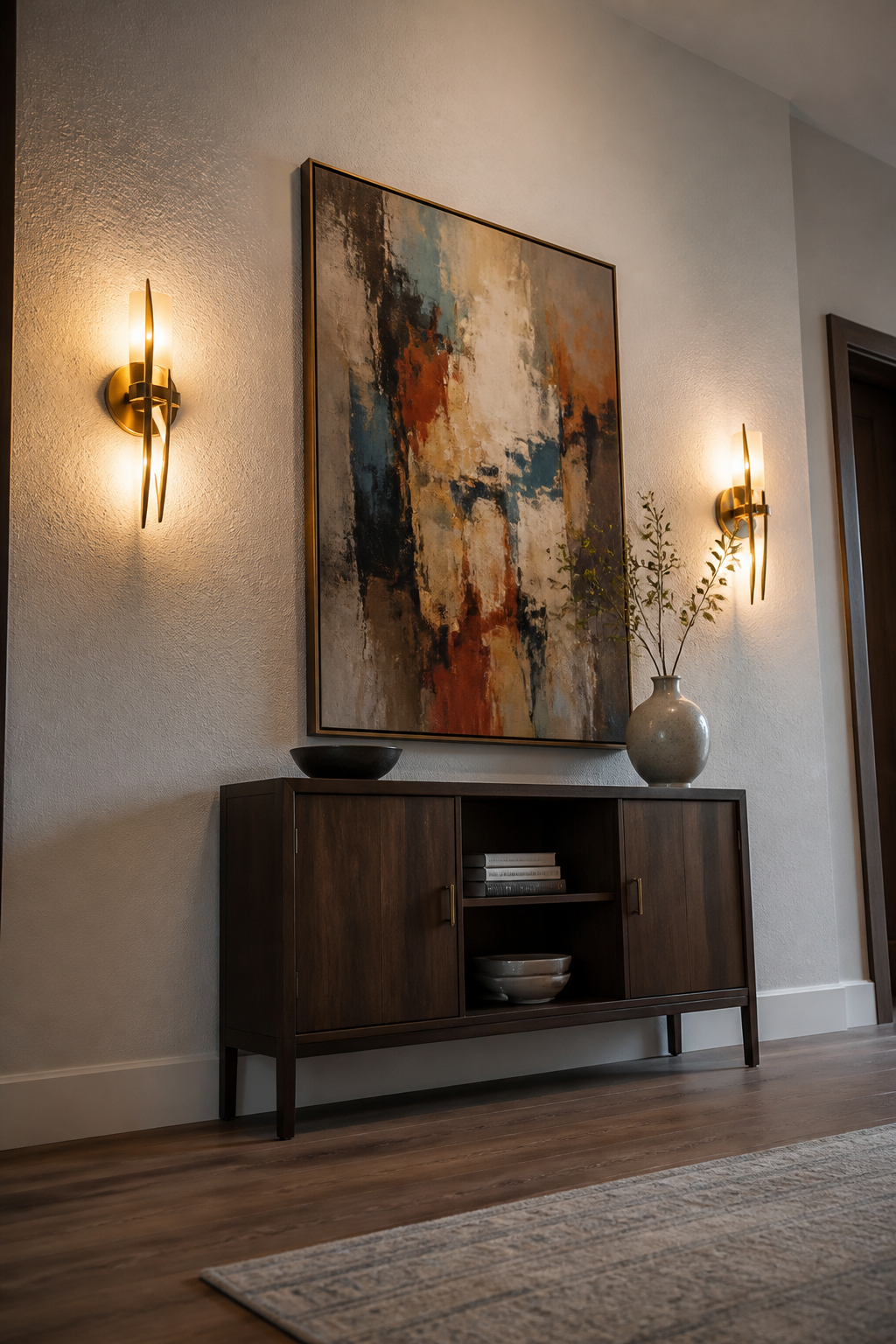
Wall sconces do the same job as art, but they earn their spot after dark. A pair flanking a canvas or a mirror turns a flat arrangement into something that reads as intentional from across the room, not just when you are standing in front of it. The vertical line of a sconce also pulls the eye upward, which helps when a sofa or console table below feels low and squat against all that empty drywall.
Battery-operated sconces have gotten good enough that hardwiring is no longer the barrier it used to be. In my last rental, I used two rechargeable brass ones on either side of a framed print and spaced them about 3 to 5 inches from the frame edge, roughly at eye level. The light was warm, the cords tucked behind the frame, and when I moved, they came with me. Pairs or a rhythmic pattern work best on large walls because a single sconce looks like a mistake in scale, and three or more need to be identical and evenly spaced or the wall starts to feel like a hotel corridor.
If sconces feel too traditional, two small pendant lights hung at the same height can flank art the same way. The effect is similar: the fixtures become part of the composition rather than just illumination, and the wall reads as finished even with the lamps switched off.
Recommended Products
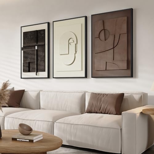
【Framed 3D Textured Wall Art】Modern abstract geometric artwork featuring a set of three large framed 3D textured pieces (16×24 inches each, 24"H x 48"W total). Each piece is crafted with airbrushed sandstone pigments on multi-layered, lightweight, moisture-resistant boards, creating both a striking visual effect and an authentic 3D textured feel. The reinforced frame provides stability and long-lasting durability. Due to the handcrafted textured process, subtle tone variations may appear under different lighting (cool or warm). Slight color differences may occur across displays. Please refer to the actual product
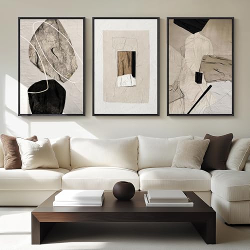
[Framed Wall Art]: Set of 3 large framed neutral abstract wall art, each measuring 24×36 inches, each painting with a sturdy frame

Striking Abstract Design: This framed wall art features a captivating abstract composition with bold brushstrokes and a harmonious blend of neutral hues.
7. Textiles or Tapestries
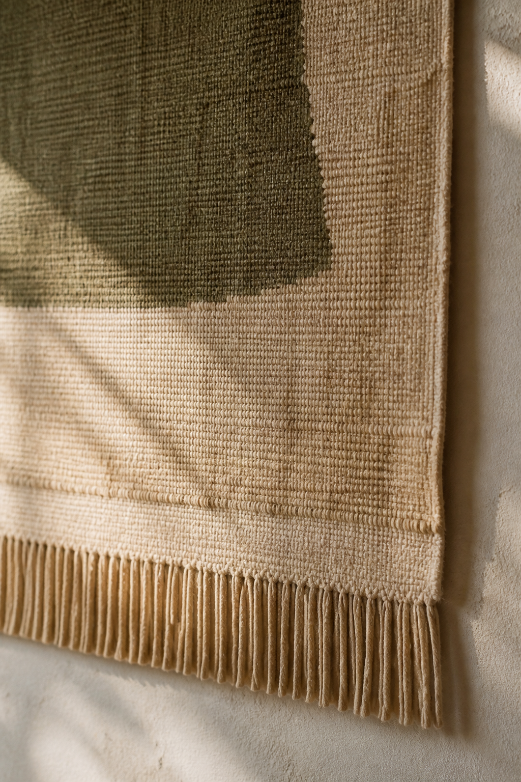
A fabric wall hanging fills the vertical space without the weight of framed art. In a room with hardwood floors and bare drywall, the softness matters more than the pattern. I hung a lightweight graphic piece with a black-and-white design behind my sofa, and the seating area finally felt anchored instead of floating.
Tapestries and woven hangings soften hard surfaces that dominate most Illinois homes: drywall, trim, flooring. The fabric absorbs sound too, which makes a difference in open-plan rooms where every footstep echoes.
Hanging method is where renters get stuck. A heavy frame needs a stud or a toggle bolt and leaves a hole to patch later. A lightweight textile does not. A simple dowel rod slipped through a sleeve, or a few clips on a curtain wire, spreads the weight across a wider area. Command strips work on smaller pieces if you read the weight limit on the package and stay well under it. The key is distributing the load so no single point tears the weave or pulls paint off in a circle.
A modern rug hung vertically works the same way. Lindsay at Makely used one as a tapestry equivalent, and the scale fills the wall without looking like you borrowed dorm-room decor. Macramé or dip-dyed fiber pieces add movement in tall spaces where a static print would just sit there.
Recommended Products
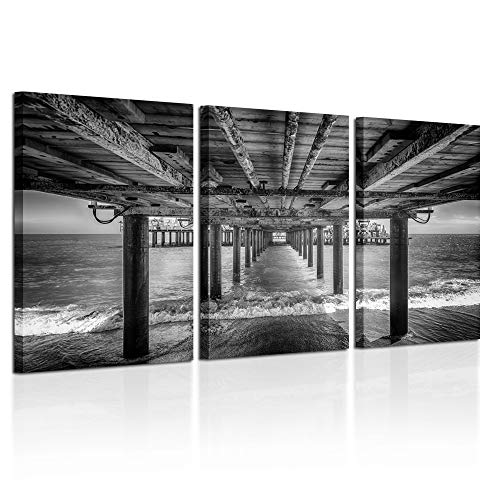
High Quality Glossy Canvas with long lasting durability Printed at high resolution using the latest state of the art colour technology ensures sharp & vivid images every time

CLASSIC & DURABLE: With sturdy frame, high definition cover, safe packing, upsimples picture frame will protect your photo and give a clear view.

MULTIPLE FRAMES COLLAGE: Bulk of 5 pieces picture frames set in the same sizes. Perfect for pictures 8×10 with mat or 11×14 without mat. The frame opening display size will be 0.5 in smaller than the photo to hold the photo in place
8. Architectural Elements
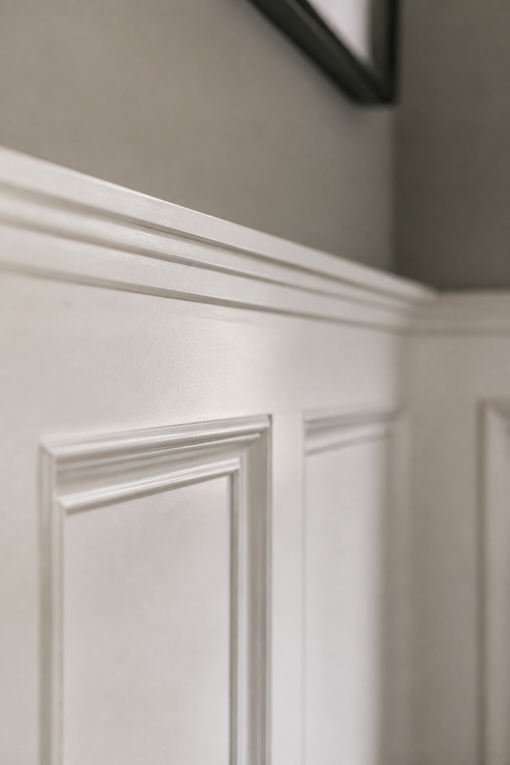
Wainscoting and applied molding break a large wall into smaller, proportional rectangles so the eye reads structure instead of emptiness. Picture-frame trim, board-and-batten, or raised paneling all work; painted the same color as your trim and brought about two-thirds up the wall, the effect reads as built-in rather than stuck-on.
The DIY route is real if you are patient with a miter box or spring for miter shears to skip the power saw entirely. I have watched friends knock out a picture-frame grid in a Saturday and spend Sunday fixing gaps where the walls were not square. For a full stair wall or anything with raised panels, a carpenter earns their fee; the material cost is modest, but the hours stack fast once you are coping inside corners and scribing to old plaster. My own rule: if the wall is over twelve feet or the house predates 1950, I price the pro first and decide whether the savings are worth three weekends of touch-up paint.
Recommended Products
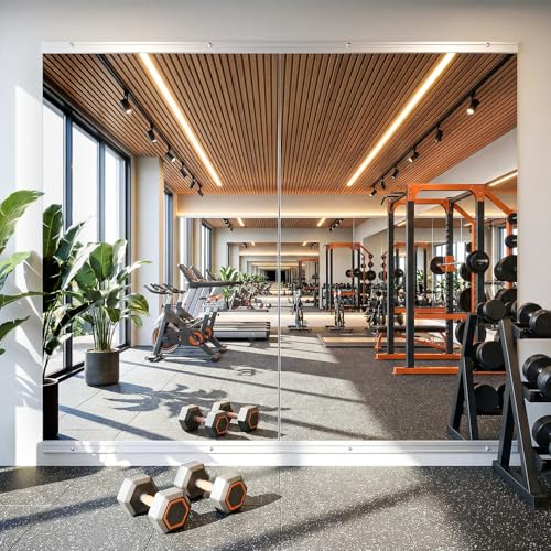
Large Full-Length Coverage — Extra-large deliver full-body visibility for workouts, yoga, stretching, or dance routines. Ideal for creating a professional gym wall in your home, garage, studio, or bedroom.

Premium Quality Material: The polystyrene frame+3mm no-distortion HD float glass to deliver clear reflection. We use commercial level material to provide a perfect wall mounted mirror to customer

Complete Value Pack: each kit includes 20 durable mirror clips, 20 heavy duty screws, and 20 sturdy wall anchors; With enough hardware for multiple projects, it's the nice all in one solution for your home renovation needs
9. Plants or Greenery
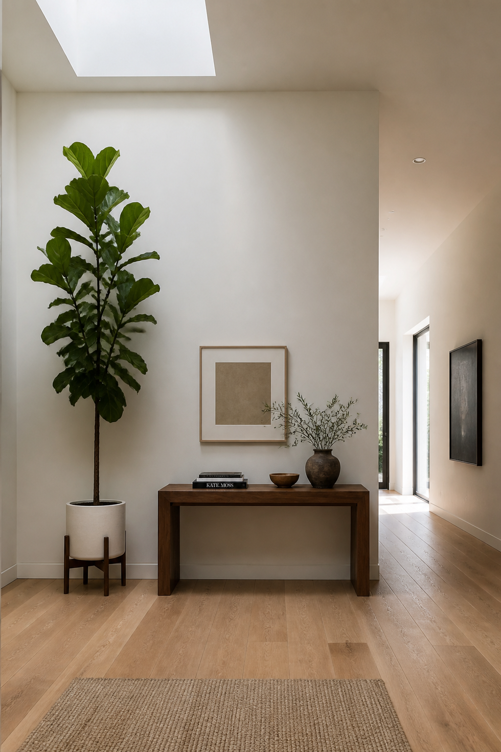
A living wall beneath a skylight, like the one designer Maite Granda installed in a Florida dining room, turns a blank surface into the room’s focal point and natural conversation starter. That kind of installation works best when the light is already there; without it, you are looking at grow lights, irrigation lines, and a maintenance schedule most people underestimate.
A single tall plant flanking a sofa gives you eighty percent of the visual impact with about five percent of the upkeep. I have watched a fiddle leaf fig go from statement piece to stick collection in a windowless corner, and the replacement cycle gets expensive fast. Wall-mounted planters with cascading pothos or ferns sit between these two extremes: more presence than one pot, less commitment than a full living system.
The honest maintenance split runs low-light tolerant varieties like pothos and succulents against anything that reads as lush and tropical. Pair either with wood or metal mounts that match your existing hardware so the structure does not compete with the green. Renters should skip the built-in irrigation and lean into modular planters they can take along; first-home owners with a skylight and a stud finder might finally have the right conditions for that vertical garden photo they have saved twice.
Recommended Products

Rustic Wall Decor for Living Room: This decorative mirror made of solid wood, torched finished features carbonized black color, and the beautiful wood texture makes it an antique accent, wThis stylish and eye-catching decor piece is the perfect addition to your house
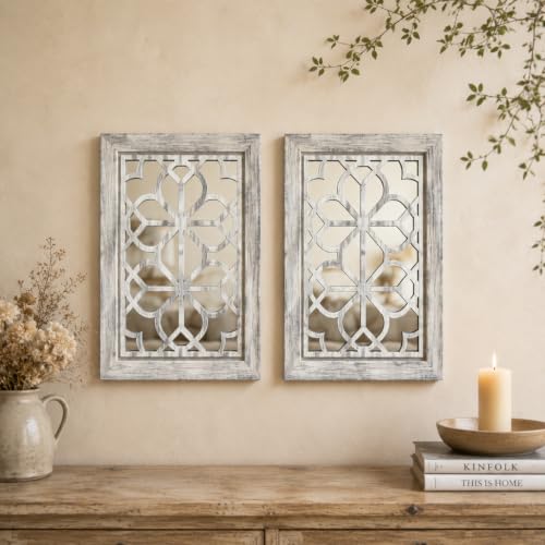
SET OF 2 11×15 INCH RECTANGULAR DECORATIVE WALL MIRRORSThis HMANGE 2-piece decorative wall mirror set features a universal 11×15 inch rectangular silhouette, delivering the perfect balance of eye-catching presence and flexible fit for most home spaces. Unlike tiny decorative pieces that get lost on blank walls, this set lets you hang the two mirrors symmetrically to create a bold, cohesive visual focal point above a sofa or fireplace, or split them between different rooms to build a unified style throughout your home with zero full renovations.

Spacious & Smart Organization: Tired of tangled jewelry, the DUMOS wall or door-mounted jewelry organizer is your ultimate solution. Effortlessly organize earrings, necklaces, rings, bracelets, and makeup tools. Features include 33 necklace hooks, 40 earring holes, 75 earring slots, 1 large ring pad, 1 bracelet bar, 4 shelves, and 2 bottom drawers. Finally, find what you need in seconds – no more morning chaos
10. Functional Furniture
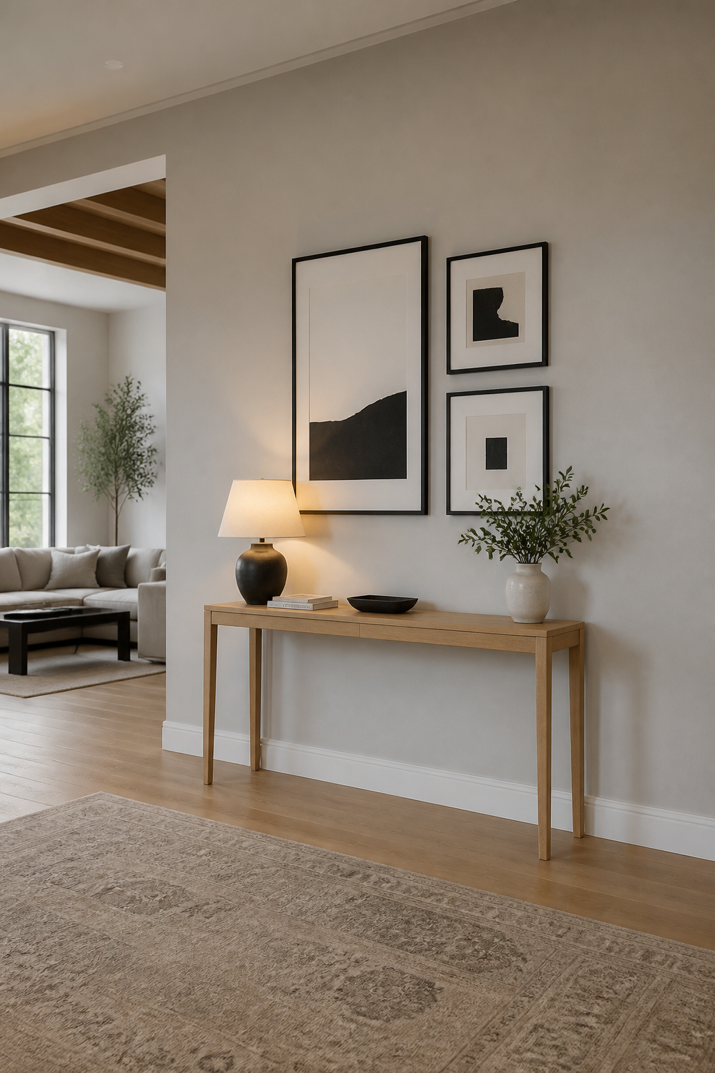
A console table or bench pushed against a large wall does something a flat arrangement of frames and shelves cannot: it gives the room a floor line. The eye lands on a real object with depth and shadow, then travels upward to whatever you stack or hang above it. That vertical relationship, roughly two-thirds furniture to one-third wall, keeps the display from feeling pasted on.
I learned this the hard way in a long hallway where the wall just swallowed picture frames. Adding a slim console table, only about twelve inches deep, broke the tunnel effect immediately. The surface collected mail and keys; the wall above it held three small hooks for bags. A piece of furniture with a job keeps the wall from looking decorated and unused.
A wooden ladder with draped blankets, a sculptural bench, or a narrow console each offers the same anchor with different storage logic. The ladder leans; the bench hides shoes; the console corrals daily clutter. Choose based on what actually collects in that room, not what photographs well. The prettiest console still fails if it fights the traffic pattern or leaves no room to pull out the bench.
Recommended Products

1.Wall art per set size:30inch x 60inch x 1pcs(75cm x 150cm x 1pcs),3.3cm Thick Frame.Waterfall Tree Landscape Picture Canvas Wall Art Print Paintings Modern Artwork for Living Room Wall Decor

Painted in 1932, Picasso's The Dream (Le Reve) is a sensual portrait of his muse Marie-Therese Walter. Its simplified curves and radiant colors transform intimacy into abstraction, symbolizing passion, beauty, and the dreamlike power of love.

Painted in 1957 at his Cannes studio, Picasso's The Pigeons combines Cubist structure with a Mediterranean palette. It reflects peace and renewal in his late years, capturing light and joy through geometric forms.
Planning the Layout Before You Hang
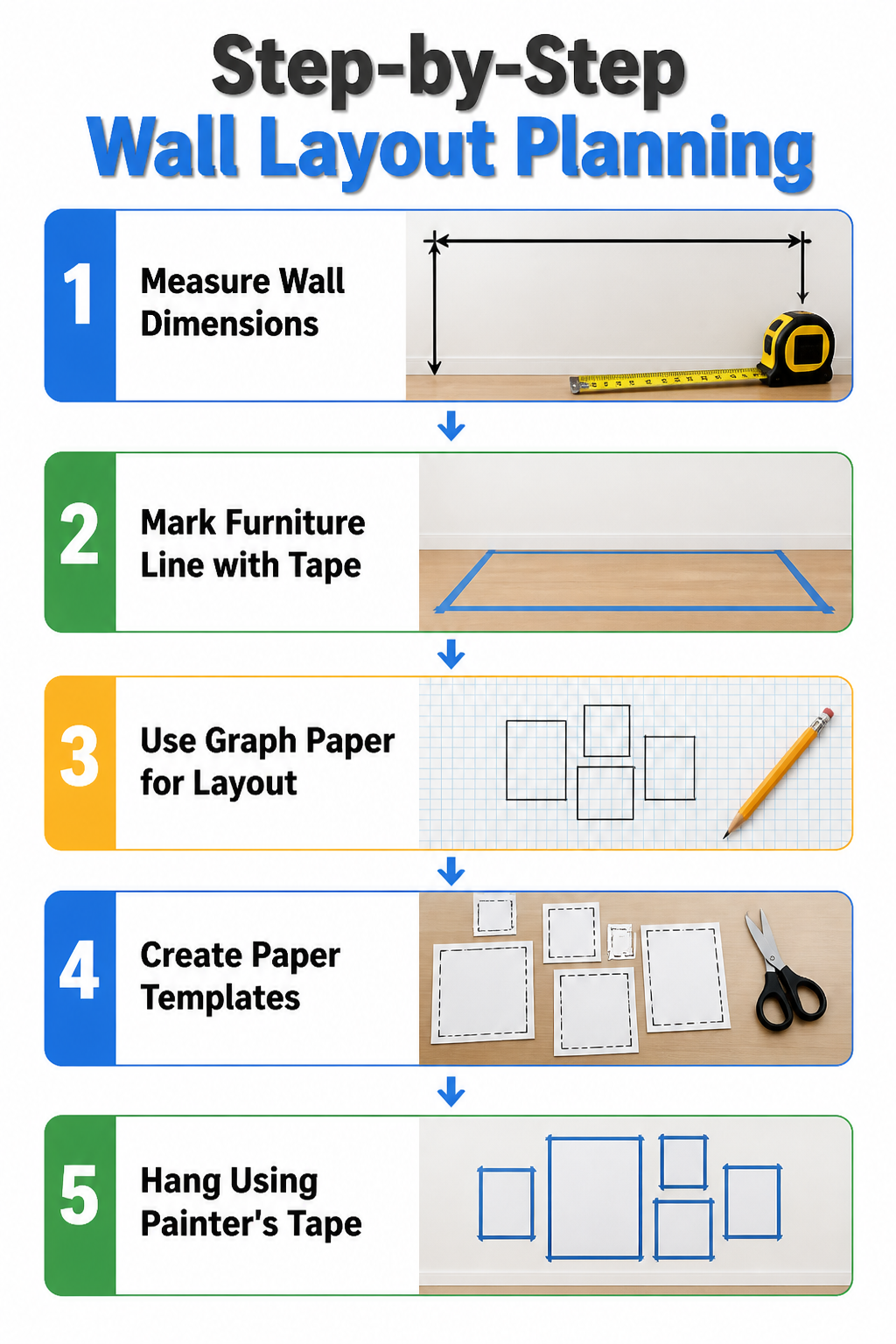
A blank wall looks smaller on paper than it does in person, which is why I stopped trusting my eyes and started measuring. Measure the wall height and width, then mark your furniture line in tape on the floor. That taped rectangle is the real shape you’re filling, not the whole drywall sheet from baseboard to ceiling.
For the actual layout, quarter-inch graph paper works, though half-inch scale is easier to read for elevations; at that scale, four squares equal one square foot. Cut paper templates to your frame sizes and shift them around before you commit. Painter’s tape outlines on the wall itself are slower but worth it for gallery groupings: the center of any piece should sit at 57 to 60 inches from the floor, standard gallery eye level. I once hung a grid six inches too high and lived with it for a month before re-doing the holes. Two holes per frame, measured twice, beats a wall that looks like a dartboard.
Scale and Proportion Rules
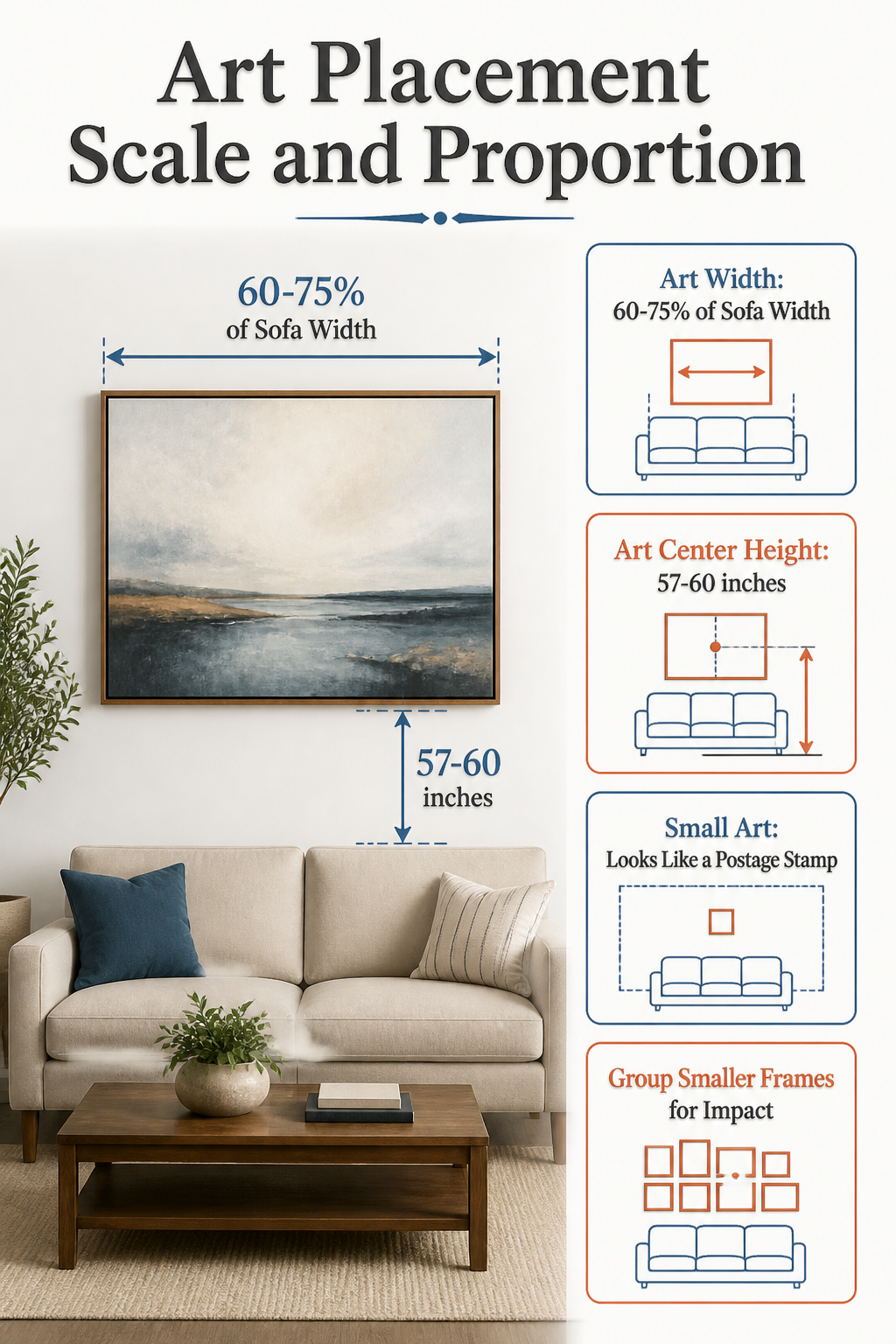
A single piece of art above a sofa should span roughly 60 to 75 percent of the furniture’s width; much smaller and it drifts toward the ceiling like a postage stamp. The center of the frame, meanwhile, wants to sit 57 to 60 inches from the floor, which lands at average eye level whether someone is standing in the hallway or settled on the couch. I hung a 24-inch print over an 84-inch sofa once and the wall swallowed it; from across the room you barely registered that anything was there. The quick test is to hold your hands up and frame the piece between them at arm’s length: if the wall keeps barging into the edges, the art is too small. Grid arrangements solve this by reading as one large unit, which is why a tight grouping of smaller frames can fill a stairwell where a lone 30-by-40 would disappear. In rooms where you mostly sit, dropping the center height an inch or two lower than the standard rule keeps the work connected to where you actually live, not just where you stand to photograph it.
Color and Theme Cohesion
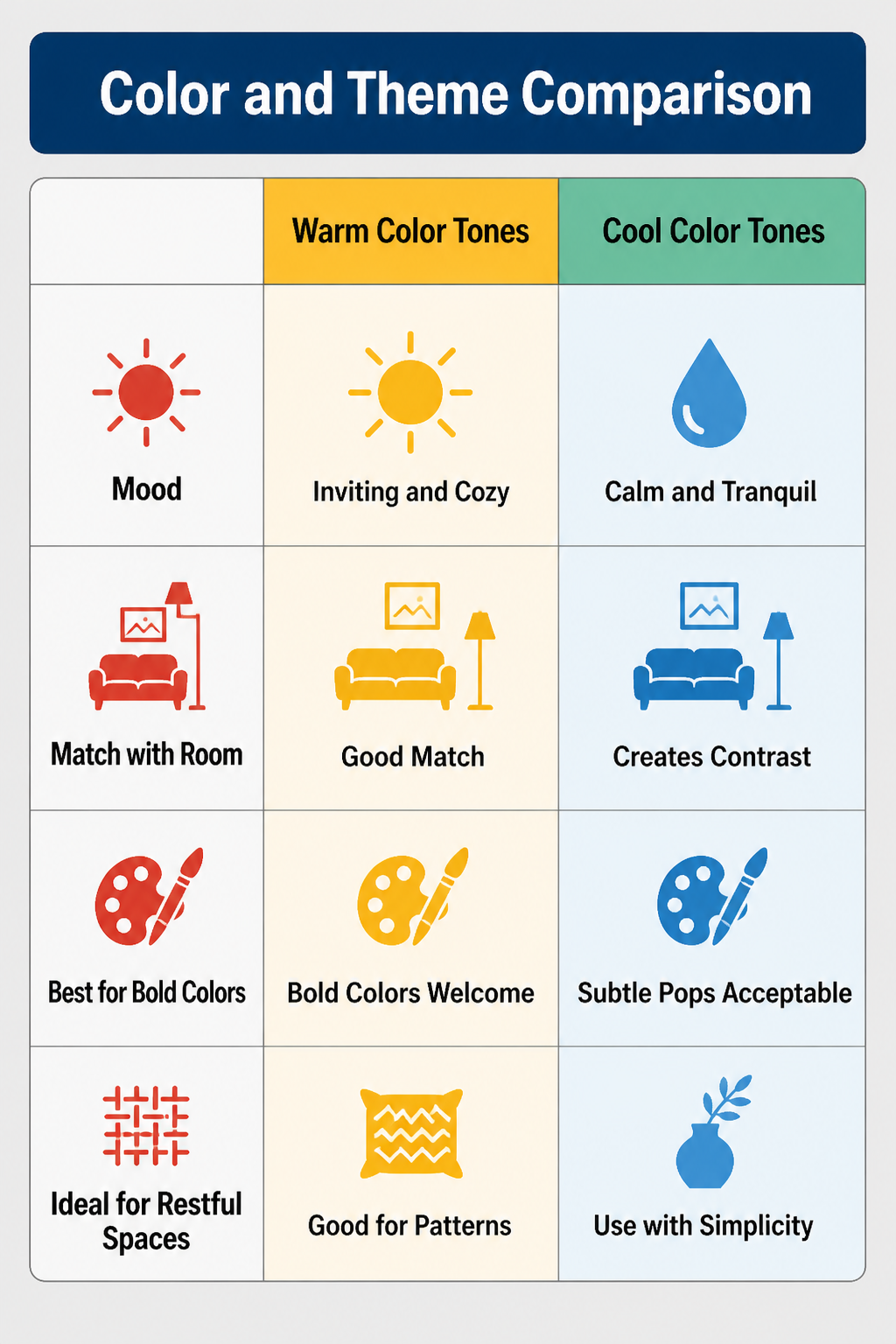
The paint on your wall is already doing half the work, and the fastest way to ruin a large wall project is to ignore it. I learned this the winter I hung a moody indigo canvas in a room where everything else read warm brown and cream. The piece looked striking alone, but against the sofa and the oak floors it felt like a window into someone else’s house. I moved it twice, tried different light, then finally admitted the color temperature was wrong and sold it at a loss.
Wall color and decor should pull from what is already in the room, not introduce a new direction. Warm tones like terracotta and gold keep a space feeling settled and inviting, while cooler shades like blue or sage green open it up and calm it down. A minimal room can handle a bold pop of color on the wall, but if the space already has pattern, varied textures, or strong furniture, a neutral piece gives the eye somewhere to rest. The match does not need to be exact, in fact, matching too closely flattens everything into one note. What you want is harmony, where the tones in your artwork complement or intentionally contrast with the furniture, flooring, and the light at different times of day. The chocolate brown of a sofa can ground a painting that carries black accents; sand-toned drapery can pick up the lighter tan in a canvas and tie the whole wall into the room without looking planned to death.
What to Avoid on a Large Wall
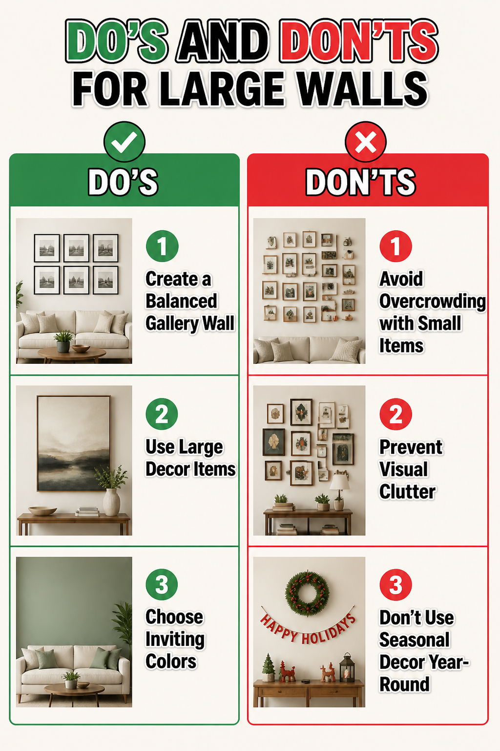
A few mistakes keep showing up on big walls, and most of them come from the same impulse: trying to fill the space too fast.
-
Overcrowding with small items turns a large wall into visual noise. A dozen tiny frames or scattered trinkets read as clutter from across the room, not a collection. The eye has nowhere to land.
-
The gallery wall that becomes a junk drawer. Groupings work when they read as one statement piece, like a grid of similar frames centered on the wall. Random sizes and mismatched subjects just look like storage.
-
One postcard-sized piece floating in all that empty space. Small objects get swallowed; the wall ends up feeling emptier than if nothing hung there at all.
-
Seasonal decor belongs in the temporary category. A wreath or holiday banner can anchor a large wall for six weeks, but leaning on rotating small items year-round keeps the space from ever feeling finished.
Frequently Asked Questions
What are some ideas for decorating a large wall?
Oversized art, gallery walls, mirrors, floating shelves, accent wall treatments, sconces, textiles, architectural molding, plants, and functional furniture like console tables all work well. Each gives the wall a clear purpose or focal point rather than treating it as leftover space. The best choice depends on whether you want the wall to recede, stand out, or serve a practical job like storage or lighting.
How do I create a gallery wall?
Plan it on the floor first: tape out the wall dimensions, arrange four to seven pieces inside that rectangle, and keep one thread consistent, like frame finish or palette. Leave 3–6 inches between frames and include one or two larger anchors so the scale reads right from across the room. Snap a photo before you hang so you remember the layout.
What height should I hang wall art?
Center the piece at 57 to 60 inches from the floor, which lands at average eye level for most people walking into the room. For rooms where you mostly sit, dropping it an inch or two lower keeps the work connected to where you actually live. A piece hung too high, like at seventy inches, can make the whole wall feel top-heavy.
How can I make a large wall feel cozy?
Add textiles like a woven hanging or rug mounted vertically, which softens hard drywall and absorbs sound in open-plan rooms. Layer in warm lighting with sconces or pendant pairs, and bring in plants or greenery that add life without the rigid geometry of frames. Wood tones and warm color palettes in whatever you hang also help the wall feel settled rather than exposed.
How do you decorate a large, empty wall on a budget?
Hit thrift stores for budget frames and build a gallery wall with what you already own, or hang a single large mirror found secondhand. Floating shelves let you rotate objects without buying new art, and peel-and-stick wallpaper can cover the whole surface for less than a statement piece. The key is committing to one approach rather than collecting small items that read as clutter.
How do I add a luxury feel to my blank wall?
Install decorative sconces, whether hardwired or rechargeable, which function as both lighting and sculpture. A pair flanking art or a mirror reads as intentional from across the room and gives the wall presence after dark. Brass or warm metal finishes pick up other hardware in the room and avoid the hotel-corridor look that identical fixtures in long rows can create.
What’s the best way to arrange wall art?
Keep the center at eye level, about 57 inches from the floor, and space pieces 3 to 6 inches apart; larger art needs even more breathing room. For a single piece above furniture, aim for 60 to 75 percent of that furniture’s width so it does not drift like a postage stamp. Grid arrangements read as one unit, which helps in tall or long spaces where a lone small piece would disappear.
Leave a Reply