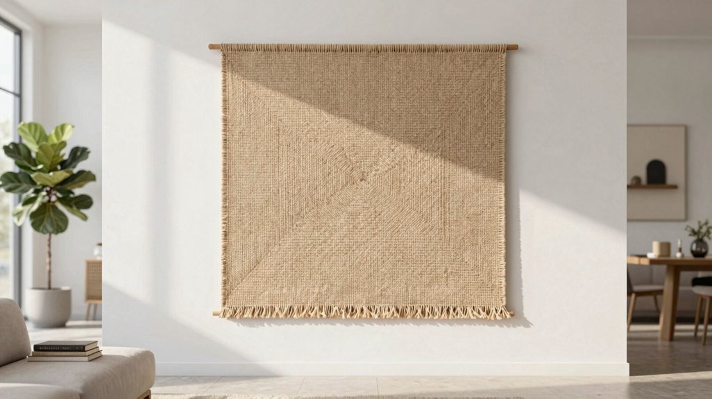
Most designers specify 60–75% visual coverage for oversized pieces, yet you’re likely underestimating your wall’s cubic volume by 30–40%. That miscalculation drives the common error of clustering small frames where mass commands presence. You’ll need proportional scale, not accumulation, to resolve spatial imbalance.
The following specifications address nine distinct methodologies, each with measurable parameters for execution. Your wall is larger than you think, and the solutions are more precise than you’ve been told.
Start With One Oversized Piece for Maximum Impact
Anchor your expansive vertical plane with a single, commanding artwork occupying 60–75% of the available wall surface, or the specific target zone you’ve designated for visual emphasis. This proportional coverage ensures your oversized wall reads as deliberate composition rather than afterthought.
Command the wall. A single bold piece, scaled to dominate, transforms empty space into intentional design.
When siting above furniture, scale your large piece to two-thirds to three-fourths the sofa or console width below. This dimensional ratio establishes visual equilibrium between horizontal and vertical planes.
Oversized framed art commands premium pricing. Consider a DIY canvas alternative: identical spatial impact, reduced expenditure.
For large blank wall scenarios, position your statement canvas behind primary seating. This anchoring technique unifies the room’s proportional hierarchy and delivers finished spatial coherence.
If singular placement feels insufficient, layer strategically: pair one suspended work with a secondary leaning canvas on an adjacent surface. This approach extends visual continuity without introducing gallery walls’ cumulative complexity.
Recommended Products
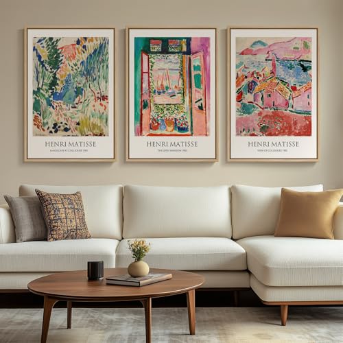
【Framed Wall Art】Set of 3 framed Henri Matisse colorful abstract wall art pieces, each measuring 24×36 inches (totaling 36"H x 72"W). The frames are made of durable and…
Build a Gallery Wall You Can Update Over Time
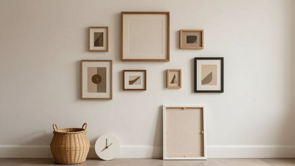
Because permanent installations often lock you into static compositions, you’ll achieve superior long-term utility by specifying a modular frame system engineered for iterative refresh. Select frames with corner grommets, such as Wexel Art configurations paired with magnetized plexi panels, to facilitate tool-free art pieces substitution without hardware reinstallation.
Plan Your Gallery Wall Layout
Outline your proposed gallery wall footprint on the floor first. Replicate spacing and visual hierarchy precisely when you transfer the arrangement to your wall space. This method yields cleaner, scalable results.
Establish Cohesive Foundation
Start with a repeatable composition mixing neutrals and texture-heavy pieces. Your gallery wall maintains coherence even when you rotate in children’s artwork or new acquisitions.
Scale for Impact
On one wall, deploy fewer, larger frames to prevent visual overwhelm. Standardize frame dimensions and finishes so subsequent wall decor ideas integrate smoothly as your collection evolves.
Recommended Products

【Important Installation Notice】Not suitable for sloped ceilings or floors with fluffy carpets. If your ceiling is suspended, please ensure it is strong enough to support the unit before installation
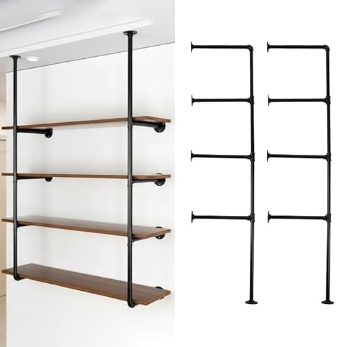
INDUSTRIAL DESIGN: Floor-to-ceiling pipe mounting system featuring 4 wooden shelves with black metal supports for a rustic farmhouse aesthetic

Maximize Storage with Larger Basket: Our 4-tier shower organizer, designed with larger basket angle to hold all your bath essentials—shampoo, conditioner, body wash, and more—these corner shower shelves offer storage for families or shared apartments. Say goodbye to clutter and enjoy easy access to everything you need while showering. This is a nice bathroom organizers and storage combining practicality and decoration
Fill a Big Wall With Floor-to-Ceiling Shelving
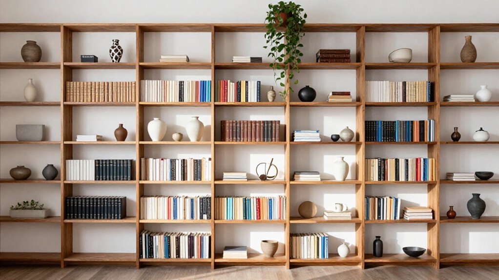
Whether you’re working with a narrow entryway or a sprawling living room, you’ll optimize vertical real estate by installing floor-to-ceiling shelving that turns dead wall area into high-capacity storage without sacrificing spatial flow.
Modular Configuration
Select a shallow 12-inch depth to preserve circulation paths, or specify an 80-configuration modular system from standard retailers for custom compartment heights without structural redesign.
Visual Composition
Alternate open cubbies with closed cabinets to disrupt monolithic massing. In a dining room, this wall decor strategy anchors the large wall while maintaining spatial hierarchy.
Styling Protocol
Layer vertically oriented books, specimen greenery, and singular oversized objects. This ensures the interior design reads intentionally at distance, not cluttered upon approach.
Clearance Standards
Maintain 36 inches between shelving faces and focal furniture (sofa, dining chairs) to sustain ergonomic traffic flow.
Recommended Products

PREMIUM QUALITY MATERIAL: An&He picture frame is made of solid wood MDF with HD PS panel, beautiful, simple and textured. It is stronger and more durable than plastic frames to protect your treasured photos

Modern Minimalist Style: Our Picture frames are carefully packaged with minimalist art in mind, featuring natural colors such as black, white, and brown. Whether used as wall hangings or desk decorations,the gallery wall frame set is suitable for all seasons. We prioritize the perfect balance of aesthetics and functionality, ensuring a comfortable and natural experience for our customers.

Multiple Sizes: Our set includes 15 multicolor frames with white pads, 3pcs 8×10 inch frames, 6pcs 4×6 inch frames and 6pcs 5×7 inch frames. Also comes with 17 trace-less nails to meet your multiple needs.
Hang a Large Mirror to Open Up the Room
When you’re confronting a cavernous void that threatens to dwarf your furnishings, you’ll deploy reflective surfaces as a spatial intervention that manipulates perceived depth and luminosity. A large mirror functions as transformative wall decor, doubling perceived square footage while amplifying natural light penetration.
Position your mirror at sofa height, approximately 30–36 inches from the floor, ensuring it captures flattering sightlines rather than ceiling fixtures. If scale constraints prevent a single statement piece, cluster multiple floor-length mirrors; one documented configuration employs eight identical units totaling $64 to fabricate a cohesive accent wall.
Anchor your mirror at sofa height—30 to 36 inches—to capture living vignettes, not ceiling glare; when scale demands compromise, cluster affordable floor-length units into architectural impact.
Strategic placement demands reflection toward illuminated zones or arranged vignettes, never dark recesses. Proportion remains critical: undersized mirrors register as decorative errors, while properly scaled specimens add visual appeal through architectural presence.
- Light Amplification: Bounce window-derived illumination deep into interior spaces
- Spatial Expansion: Create illusory adjacency through reflective duplication
- Economic Clustering: Deploy multiple affordable units for cumulative impact
- Focal Calibration: Target styled consoles or dining arrangements for reflected content
Recommended Products
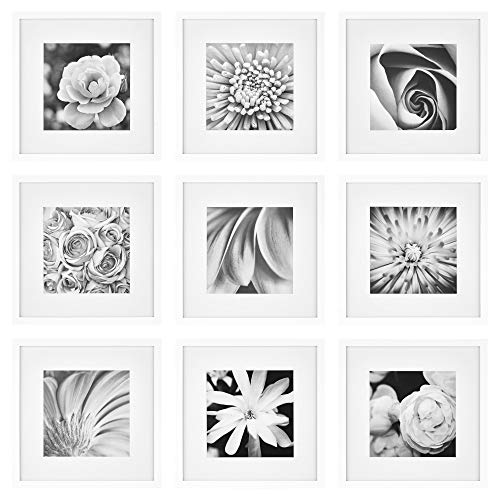
ELEVATE YOUR GALLERY WALL: With the Gallery Perfect 9-Piece Square Photo Frame Set, featuring nine square frames in a sophisticated grey wood finish. Each frame is equipped with a removable classic white mat, adding a timeless elegance to your displayed photos or artwork. The neutral grey tone complements any decor style, while the square shape adds a modern touch to your wall arrangement. Whether showcasing family portraits, travel memories, or artistic prints.
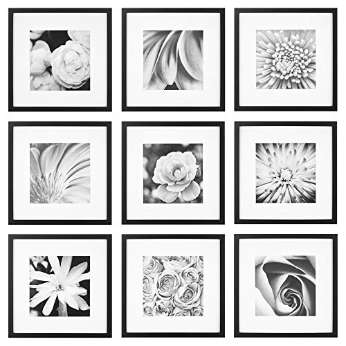
ELEVATE YOUR GALLERY WALL: With the Gallery Perfect 9-Piece Greywood Square Photo Frame Set, featuring nine square frames in a sophisticated grey wood finish. Each frame is equipped with a removable classic white mat, adding a timeless elegance to your displayed photos or artwork. The neutral grey tone complements any decor style, while the square shape adds a modern touch to your wall arrangement. Whether showcasing family portraits, travel memories, or artistic prints.

ELEVATE YOUR GALLERY WALL: With the Gallery Perfect 9-Piece Greywash Square Photo Frame Set, featuring nine square frames in a sophisticated grey wood finish. Each frame is equipped with a removable classic white mat, adding a timeless elegance to your displayed photos or artwork. The neutral grey tone complements any decor style, while the square shape adds a modern touch to your wall arrangement. Whether showcasing family portraits, travel memories, or artistic prints.
Add Architectural Detail With Molding or Millwork
You can improve expansive vertical surfaces through strategic millwork applications that introduce dimensional hierarchy without structural modification.
Budget-Friendly Wainscoting Options encompass picture-frame molding installed at 36–42 inches height for traditional proportion, or full-height paneling at 1/3–1/5 material cost of custom built-ins; MDF trim runs $0.50–$1.50 per linear foot versus solid wood at $2.00–$5.00, with comparable paint-grade finish results.
Vertical Board-and-Batten Impact exploits 2.5–4 inch vertical battens spaced 12–24 inches on center to elongate perceived ceiling height by 15–20 percent, a technique particularly effective on walls exceeding 12 feet width where horizontal segmentation would compress spatial perception.
Recommended Products

Large Canvas Wall Art for Living Room: Designed as large canvas wall art for living room, this 24×48 inch horizontal piece is ideal for styling above a sofa, console table, entryway bench, or open wall. The warm gold-brown background and ivory dot pattern make this living room wall decor easy to match with modern furniture and neutral home accents.

Premium Hd Giclee Print Technology This coastal beach wall decor is produced with high-definition giclee printing on durable waterproof canvas. Crisp details of clear blue sea, foamy surf and soft white clouds are truly presented, fade-proof ink retains bright color for long-time indoor use.

HAND-FINISHED TEXTURE: Raised white and coral wildflowers create visible depth across the rustic cottage landscape.
Budget-Friendly Wainscoting Options
Although traditional wainscoting often evokes costly custom millwork, you’re able to achieve comparable architectural impact through strategic material selection and simplified installation protocols. You change a wall without blank space into polished wall decor when you install ready-to-paint chair rail plus panel molding kits, painting them same-day so seams read as intentional shadow lines rather than patchy afterthoughts.
Budget-Conscious Wainscoting Strategies
You add texture and architectural credibility through these methods:
- Pre-cut trim sets: Chair rail kits install rapidly, minimizing labor overhead while establishing classical proportion
- Simplified patterns: Single chair rail with rectangular lower panels reduces alignment variables on expansive surfaces
- Faux wainscoting: 1x strips or MDF panel molding over drywall, caulked and painted, yield convincing millwork illusion
- Paint-first economics: Semi-gloss white trim against matte walls creates tonal hierarchy without material proliferation
Maintain chair rail height at 32–36 inches; scale panel widths to room dimensions. Restrict profiles to one feature level, excessive layering reads visually busy and escalates cost.
Vertical Board-and-Batten Impact
Because vertical lines draw the eye upward, board-and-batten turns expansive wall surfaces into architecturally articulated planes that emphasize ceiling height and spatial intentionality. You install evenly spaced narrow battens over wider boards, creating rhythmic vertical lines that stretch from floor to ceiling.
Budget Implementation
You can simulate authentic millwork using joint compound: apply over guide lines, dry, then sand crisp edges. Paint completes the effect. Monochrome palettes emphasize shadow depth; two-tone treatments amplify graphic impact.
Functional Advantages
Board-and-batten works as self-sufficient living room wall decor, reducing dependency on large art. Smaller pieces fit within vertical panel “frames.” For proportional balance, extend with picture-frame molding or chair-rail bands, creating architectural panels without built-ins.
Soften the Wall With Tapestries and Woven Hangings
- Select vertical or textural patterns to generate optical movement across lime-washed surfaces
- Exploit differential light absorption; fibers catch illumination variably across irregular plasters
- Layer smaller woven pieces atop larger textiles to prevent planar flatness
- Employ lighter mounting hardware in seismic zones, reducing mass-related hazards
This approach prioritizes material presence over compositional complexity.
Recommended Products

[Framed Wall Art]: This large framed wall art set includes 3 pieces of boho modern neutral abstract wall paintings, each measuring 24 x 36 inches, with a total display size of 36" H x 72" W. The black and white geometric design creates a clean and stylish focal point for your living room, bedroom, office, or dining room

Modern abstract wall art szie :This modern abstract bohemian style picture measures approximately 58×29 inches and can dramatically change the impression of your living room or office.

Wood Framed Coastal Wall Art: This extra large framed abstract beach wall art, 32 x 48 inches, features a horizontal blue and white ocean seascape with soft sunlight filtering through the clouds, a calm abstract nature scenic print ideal above bed or sofa. It decorates the space, adding a sense of peace and artistry to your room
Add Character With Peg Rails and Wall Hooks
While tapestries soften surfaces through textile mass, peg rails and wall hooks introduce modular utility with minimal spatial encroachment.
Peg Rails: Modular Systems for Empty Walls
You mount peg rails to fill an empty wall without bulky shelving. You add and rearrange hooks for artwork, bags, or kitchen items as needs change. You create a center of attention when you align multiple rails with even spacing, then hang lightweight frames or baskets in gallery-like configurations.
Wall Hooks: Function in Pass-Through Zones****
You install wall hooks in corridors and entryways because they add color and draw the eye while maintaining shallow profiles. You avoid traffic-flow interference.
Cohesion Through Specification
You select one metal finish, black or brushed, and standardize hook types: straight hooks for bags, double hooks for coats. You achieve intentional, uncluttered lines.
You experiment first; you decide on built-ins later.
Recommended Products

Smart Vertical Garden System: Transform any corner into a thriving botanical hub! Our telescopic tension rod (3.6FT-9.8FT) adapts instantly with a button-press spring mechanism—ideal for sloped ceilings or unique room layouts. Four customizable tiers let you showcase trailing plants, heavy pots (77lbs/tier), and decor for a dynamic display.


Save Floor Space:Make the most of unused vertical space with a floor-to-ceiling shoe organizer that keeps shoes neatly organized without taking up valuable floor space
Create Pattern With Wallpaper or a Painted Strip
You can anchor a towering wall with Vertical Stripe Impact by painting evenly spaced bands, typically 8–12 inches wide, in alternating sheens or complementary hues; this elongates the visual plane without requiring dimensional millwork.
For Geometric Pattern Play, you’ll apply painter’s tape in tessellated configurations, chevrons, or scaled grids, measuring repeat intervals precisely so the motif reads cohesively across 10+ feet of surface.
Both approaches demand that you establish a dominant focal band, usually at seated sightline, 36–42 inches from the floor, while subordinating adjacent fields to flat, single-tone finishes that prevent chromatic competition.
Recommended Products

Aluminum Photo Frames: Crafted from lightweight aluminum, our metal picture frames provide a modern, rustic look while ensuring long-lasting use. The sleek finish adds a touch of elegance to any setting

Multi-size: 10pcs picture frames set come with ONE black frame 11x14in with mat for 8×10 photo, TWO wood grain brown frames 8x10in with mat for 5×7 photo, FOUR gray frames 5x7in, THERE black frames 4x6in. Come with HD plexiglass to protect your picture(Please tear off the protective film before use, there is a protective film on both sides of the plexiglass).

【Artistic Inspiration】Enhanced with natural landscapes, botanical plants, and abstract prints in warm tones, this picture frame set creates a sense of warmth and tranquility.
Vertical Stripe Impact
Because a blank wall of significant scale can flatten a room’s spatial dynamics, you’ll want to introduce a vertical stripe motif that actively manipulates perceived ceiling height and visual rhythm. This approach turns a big empty wall into a wall without blank space while delivering design ideas that add color and architectural interest.
Map 4–8 inch stripe widths with painter’s tape, maintaining consistent spacing for intentional visual cadence. Pair one dominant hue, such as a rich shade of blue, with a softer companion like cream to introduce chromatic depth without visual cacophony.
Apply stripes floor-to-ceiling on the focal wall only, preserving adjacent surfaces as negative space to prevent pattern saturation. Extend bands to the ceiling when the room features tall windows or high ceilings, reinforcing vertical proportion and eliminating emptiness.
Geometric Pattern Play
If you’re confronting a wall that exceeds standard residential proportions, geometric wallpaper or a patterned mural functions as a self-contained visual system, removing the need for supplementary framed artwork while establishing a continuous, immersive field.
Scale and Application
Select your geometric design strategically. Larger motifs operate as architectural elements, advantageous for wide walls; smaller repeating configurations suit narrower sections without visual saturation. For budget-conscious execution, paint a 12–18 inch vertical or angled strip, repeating it vertically to generate pattern movement while preserving surrounding blank space in a subdued color palette.
Technical Execution
Map geometry with painter’s tape; test symmetry via floor marks before application. Balance the wall art with solid, low-pattern elements: simple shelving, plain textiles, or a single large mirror. This restraint ensures your geometric focal point reads as intentional design, not visual noise.
Anchor the Wall With a Console Table Display
Against a vast, unbroken plane of drywall, a console table functions as a deliberate grounding element, establishing a vertical datum that organizes the wall into measurable, functional zones. You center or intentionally offset this console table beneath your wall art to create a clear visual anchor. Then, you add a large mirror on top to amplify light and make the space feel more expansive.
Position the console table centered or offset beneath wall art to anchor the composition. Scale the large mirror to roughly match the console width; hang at eye level for cohesion. Style a tight “vignette stack”: one tall object, one to two medium pieces, one tray or bowl. Repeat materials or colors from your existing palette so the display fits naturally.
This pairing lets you fill the space deliberately without overwhelming it.
Recommended Products


EASY TO USE: Our wall stencil is incredibly easy to use, even for those who have never used a stencil before. Simply apply the stencil to your desired surface, and paint over it with your favorite colors!

VARIED SIZES: This pack includes two 8×10, one 11×14, one 7×9, three 5×7, and three 4×6 frames
Leave the Wall Empty (Yes, Really)
You’ve anchored your console table display, but now consider the counterintuitive power of restraint: negative space operates as an active design element, not an absence. When you allow a wall to remain unadorned, you create visual respiration that prevents cognitive overload and establishes hierarchical balance among existing focal points: windows, fireplaces, built-ins, or dominant furniture groupings.
This intentional void, what professionals term “rest as design,” grants the eye calibrated recovery zones while amplifying the impact of adjacent decorated surfaces through contrast.
Recommended Products

Printed & Hand-Textured – High-definition printing preserves the delicate landscape details, while hand-painted texture adds depth and a crafted finish.
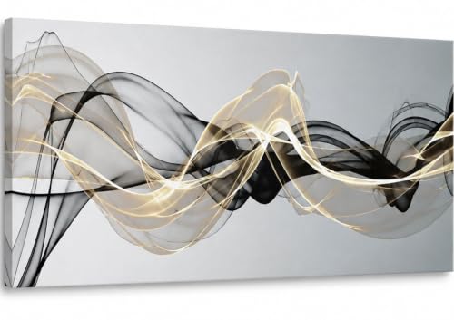
Modern Abstract Wave Design:This 20×40 inch abstract wall art features flowing black, gold, and grey wave elements in a minimalist composition. Designed to bring a sense of movement, elegance, and visual balance to modern interiors

This medium-oversized framed canvas is 70 inches wide by 31 inches high, designed for wide slim blank accent walls in urban lofts, high-rise apartments, guest suites and narrow entryways. Its wide oversized proportion creates an instant minimalist luxury focal point without crowding compact high-end living spaces.
Rest Is Design
Considering the visual load already present in your interior, leaving a substantial wall entirely empty constitutes a deliberate design strategy rather than an omission. You recognize that rest is design: a purposeful pause that prevents visual fatigue in compositions already dense with architectural features or furnishings.
When executing large ideas for spatial balance, you deploy neutral color fields as active participants in the room’s hierarchy. You create space that’s intentionally unmarked, allowing adjacent elements to command full attention without competition.
Your empty part of the wall still performs functionally through these tactics:
- You relocate storage to floor-standing consoles or shelving units, liberating vertical surfaces from obligation
- You apply washes of pigment or mural treatments to introduce chromatic interest without object-based clutter
- You respect regional safety constraints, particularly avoiding heavy installations above sleeping areas
- You permit circulation paths to breathe, reducing perceptible density in open-plan configurations
Negative Space Rules
Although every instinct may urge you to fill a vast vertical plane, you’ll achieve superior compositional outcomes when you treat absence as an active part of your plan rather than a void requiring remediation. Negative space functions as breathing room, allowing adjacent furnishings to command full visual authority.
Strategic Application
You designate one central element: a sofa, architectural window, or textural rug, while keeping the wall behind it deliberately quiet. This prevents visual cacophony; the eye registers intentionality rather than omission.
Addressing Apparent “Unfinished” Concerns
You redirect decorative energy toward functional alternatives: substantial art on neighboring surfaces, integrated shelving systems, or sculptural storage. The goal is fewer, larger ideas executed with precision rather than accumulation of small pieces that fragment spatial coherence.
Practical Constraints
In open-plan circulation paths or seismic zones, you’ll find a wall without adornment is among the best solutions, eliminating hazards while preserving spatial fluidity.
Leave a Reply